(Approved by studio to share works on portfolio) A cancelled multiplayer sandbox game project, the goal was to bring people together through imaginative roleplaying campaigns accessible to all.
As the solo UI designer, I lead the UI design with support from the Art Director and UX Director and UX team to design the style of the UI and create a visual design system. Working off the provided UX wireframes, I designed updated flows created by the UX designers and build components and style guides to translate the functional designs into visually aesthetic elements.
Role: Senior Visual Designer (UI)
Platform: PC/Console
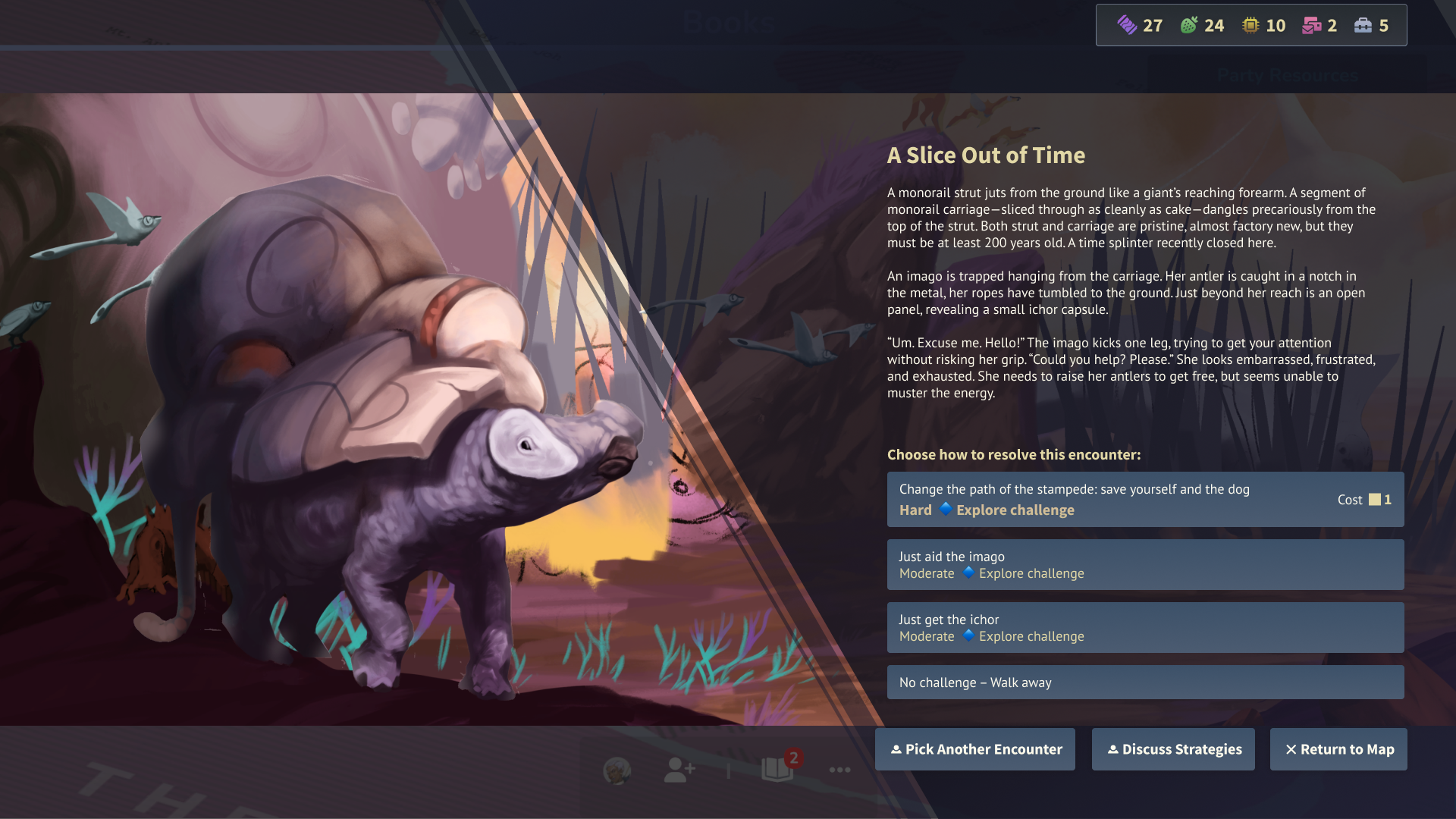
For a feature rich multiplayer sandbox game with stage editing functions, the biggest challenge is real estate. In order for the players to be able to access all aspects of the game easily through the HUD and be able to play at the same time, multiple panels are open at once while also allowing players to view the gameplay happening on stage. There is also the unique aspect of having a video avatar embodied by the players that aren’t the characters in the game, in a tabletop roleplaying sort of way. In order to fit them all well while being able to allow the players to enjoy the game fully, all panels have to be modular, scalable, and responsive. In addition, we were creating an entirely new IP that no one has seen before, the UI needed to be sci-fantasy but feel modern at the same time in order to match the world and characters that we’re creating.
Design Process
Competitive Analysis
I start off the project usually by gathering references and breaking down UI aesthetics into the categories below to help me understand how similar games approach their UI design.
Style Exploration
To design a style of a completely new IP, I looked at the art direction and lore of the game and picked out some overarching themes used throughout the project to determine the art style of the UI. The UI needed to complement the play space without being too intrusive, yet not look too utilitarian to prevent players from feeling like they’re using a work software. The result was a combination of clean, gridded UI with small, world-related design elements.
Initial UI design passes, some of the themes were: Retro futurism x Magic, Constellation Storytelling, Adventuring in not-National Parks and Gritty post-apocalypse
We landed on a theme that was a more modern version with clean icons and typography while saving the elements of constellations and adventuring for theming. Going with a more muted palette also helped the UI separate from the BG while allowing the colorful, sci-fantasy play space to shine through.
Design System
Our game was focused on accessibility as we wanted all players to be able to play with ease. All colors, typography, and iconography are designed with WCAG guidelines in mind.
Colors
To ensure that the UI reads between dark and light backgrounds, we picked a dark panel with light text for easy readability across screens and stage lighting.
Typography
We chose Source Sans Pro and PT Sans as our header and paragraph text respectively. We needed typefaces that worked well in our post-modern setting and also be easy to read in long paragraphs as our game contained a lot of lore for players to read. It also had to contain glyphs across various languages as we prepared for localization.
Design Elements
With the theme of constellations, I used various combinations of circles and lines to create elements throughout the UI.
Iconography
Clean, minimalist iconography was used for navigational icons for clarity and readability across scales, and also to separate from the more illustrative and game specific icons like abilities and attributes. It also adds a modern touch to our sci-fantasy genre as the lore is set in a post-apocalyptic modern world.
Layouts
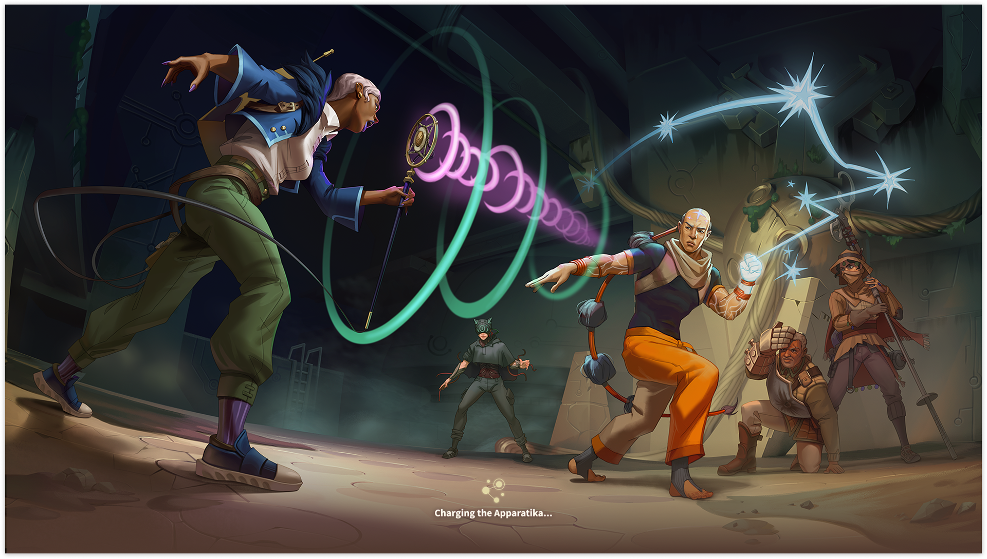
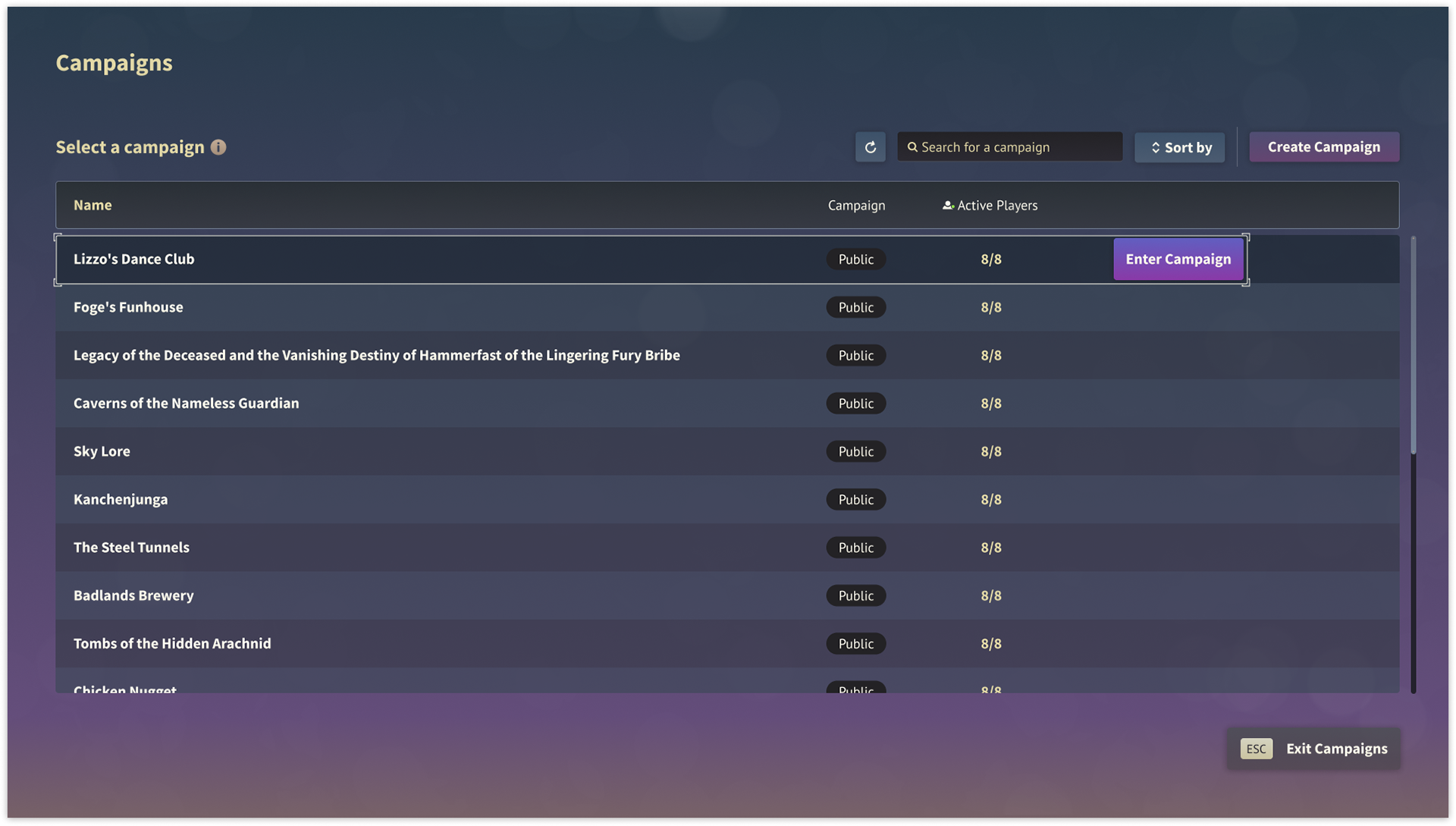
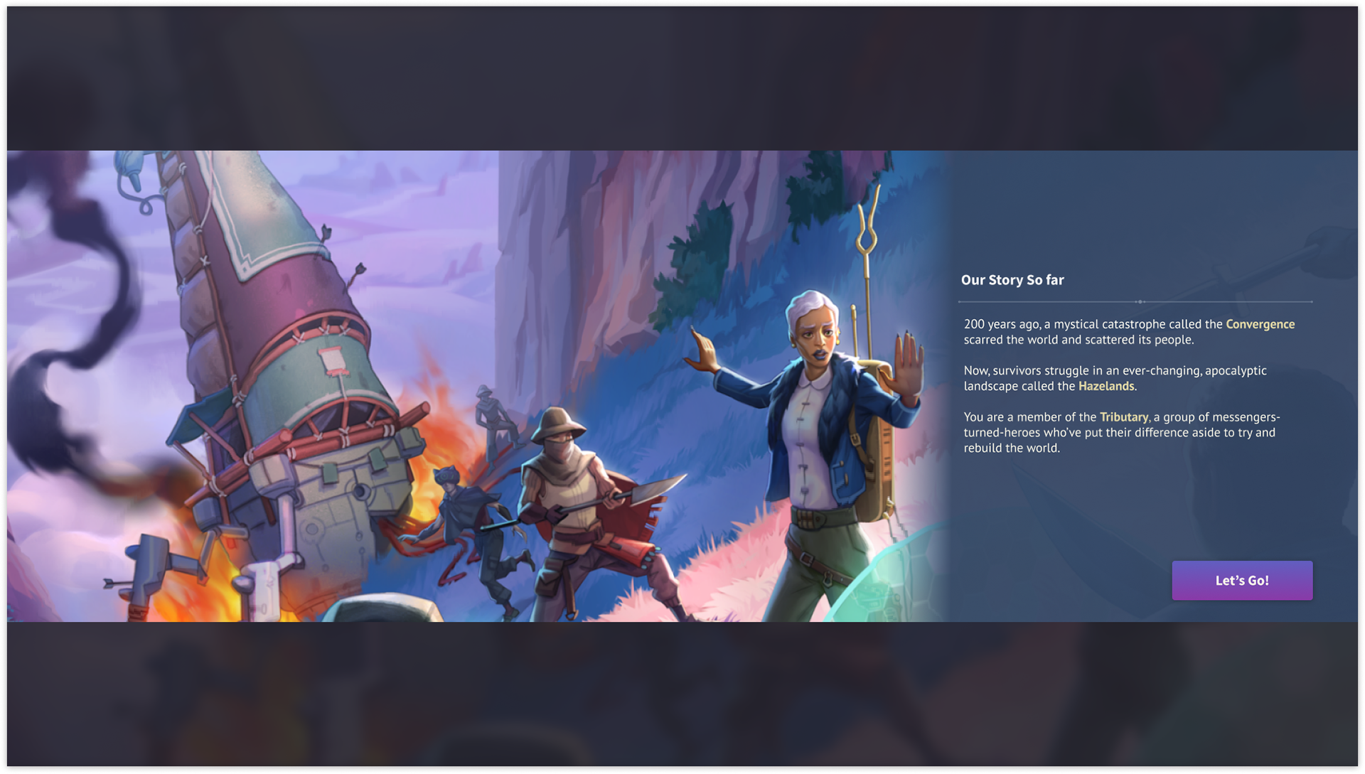
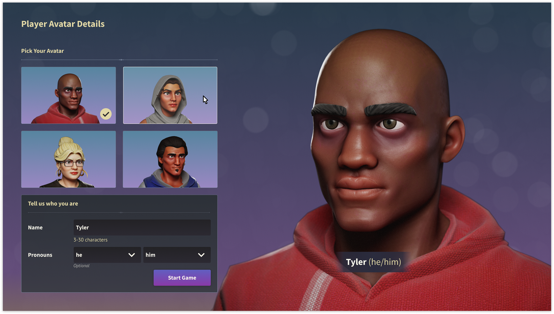
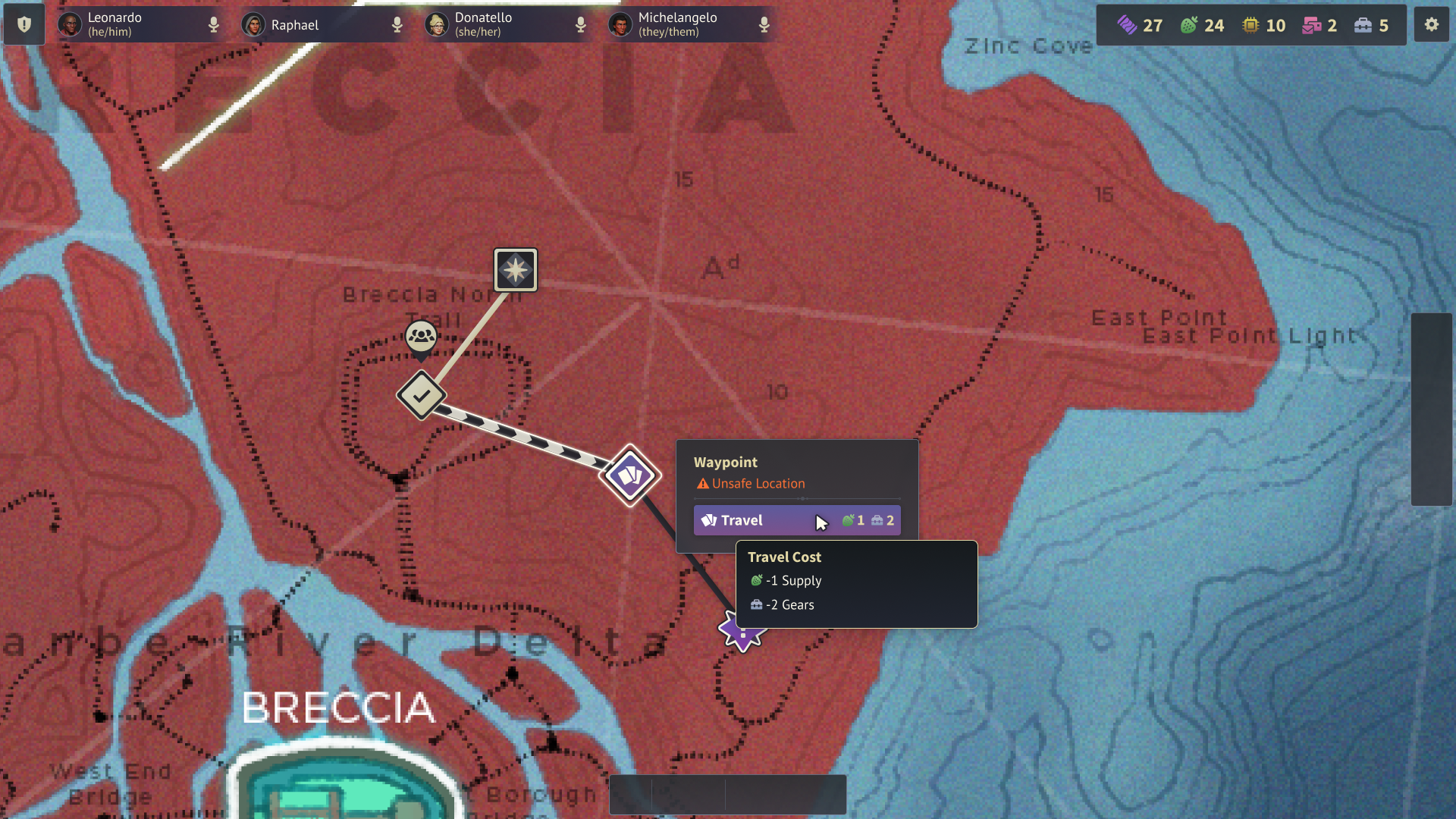
Using the design systems above, the elements come together to form cohesive layouts that resonate throughout the game. These are some of the screens chosen to represent the overall UI art direction.
In-Game Graphics
I also created some in-game graphics for a futuristic, military faction in the game. I crafted a fake language typography to represent the language used in the game that's meant to look like it's readable in both vertical and horizontal formats.
